How to use colours within your garden design
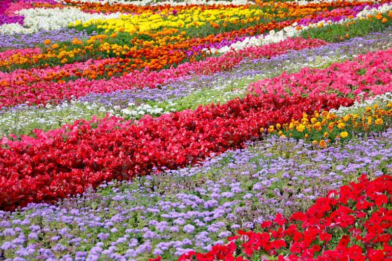
Colours and their varying shades and hues have a massive effect on the mood and perception of a garden design. Whatever theme or feel you are trying to convey within your design is heavily influenced by the colours you choose to use, in both plant and material selection.
What are you trying to create? A design that is intended to be relaxing and allow you to unwind might have a costal/water theme and include blues, violets and purples with a background of green. Or, you might instead choose an English garden theme and use more pinks and yellows with light-hued stone to create a warm and welcoming feel.
As you can see, the choice of colour is crucial to carrying off the right mood successfully. Your favourite colour might be blue, but if you are wanting a garden design that is tropical and dramatic, your colour scheme will need to include reds and oranges set against the green for a bright and striking effect. Blue would detract too much from that result if over-used.

Here is the low down on colour…
Cool Colours:
Blue-purple, violet, all shades of blue, blue-green, mint-green, and soft greenish yellow.
All blue-based pinks – mauve, lavender and ice pink.
Blue-based reds – crimson, magenta, burgundy and purple.
These create the perception of cool and quiet – although you can use the different shades and tones to dramatic effect within a design.
Warm Colours:
Strong greenish yellow, golden-toned yellows, gold, orange, tan and sienna.
Yellow-based pinks – champagne, cream, apricot, flame and salmon.
Pure and yellow-based reds – scarlet and pillerbox red.
Be aware of Perth’s very bright and sometimes harsh sunlight. Using these in their brightest shades and in large quantities can create an effect that is hard on the eyes. Using the warmer tints can be a better idea than the purest shades for use in large amounts.
Colours and the moods they can create.
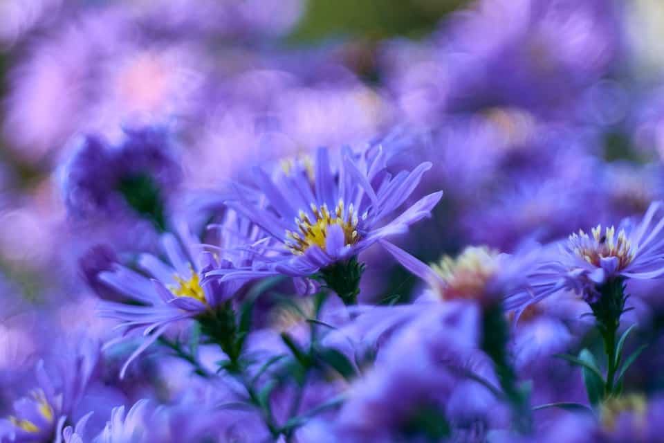
Blues, violets and purples:
Think cooling – clean, calm, restful, shade, water/sea, relaxing and unwinding.
These are easy on the eyes at a distance and close up – even in Perth sun.
Use in high intensity shades for dramatic focal points in your design, as contrast for brighter colours or to give the illusion of length or distance, for example; line a path with flowers in these shades to make it appear longer and inviting to explore.
Green:
Think calming – nature, gentle, soft, life, harmony. Green is the background to life, and always the backdrop of every garden.
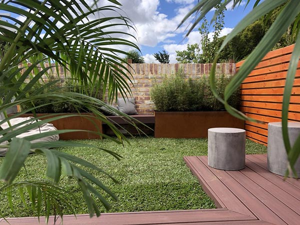
Easy on the eyes, green is physiologically and physically cooling in summer and used in the right shades is the perfect way to highlight the focal colours in your design. Harmonises well with blue and yellow and provides a strong contrast for red.
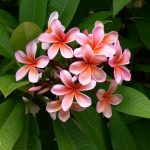
Yellow, gold and orange:
Think warm and hot – cheerful, sunshine, happy, tropical, beach, summer, bright.
Yellow colours are easy contrasts to white, blues and purples, and silver grey and blue grey foliage.
Tips – Don’t use cool red and pinks with pure yellows unless you want an awful clash. Be aware that a lot of the yellow foliaged and margined plants can burn or bleach in a Perth summer – some will need shade in the afternoons to stay healthy and happy. Orange can be used near reds if you also include a lot of pure green in that area of your design.
Red:
Think HOT – bright, dramatic, attention-grabbing, romantic, passionate, tropical, danger, flamboyant.
Red is great when used in tropical or Mediterranean garden designs to give that exotic flair to a garden. Use as accent or focal points to not overwhelm your design with too much drama, or make it hard to look at in bright sunlight. Placed in the foreground of a design it grabs attention and when placed at a distance, red creates an excellent focal point to draw the eye. Use with green to make it really pop.
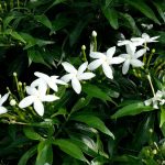
White:
Think pure – calm, clean, organised, cooling, modern, or in sun, glary and bright.
When in full and direct sunlight, white is very hard on the eyes. We’ve all seen gardens with concrete slabs or light coloured pavers in a central area – you can’t see past them to anything else in the landscape. If you are designing a night garden however, white shows up in the moonlight for a gorgeous effect.
White goes well with most colours and contrasts wonderfully with red, purple and bright dark blue, and harmonises with the soft pinks and blues for a sweet, calm effect. Use as a connecting colour to link brighter colours in your garden, or to create a break between colour schemes.
Modern colour schemes often lean towards monochrome. White, black and grey are used for a clean and classy effect, with a simple background of green – usually ferns and plants with minimal colours and flowers.
Other garden design themes can be urban, desert, tropical, beach, or in a landscape or garden ‘style’ taken from cultural and historic gardens, such as Italian, English, Japanese, or Spanish colonial gardens.
Whatever style you choose for your own garden design, make sure to pay careful attention to your use of colour within it – this can make or break the final effect of your design!
For help selecting a theme, colours or designing your landscape, give our expert landscape designers a call – we would love to help you create your dream garden!